Flickr trials new photo page design
My opinion on the new-look Flickr photo page.
Flickr is currently trialling a new layout for their photo pages. Selected users are being offered the opportunity to test the layout and provide feedback.
The new design repositions metadata from below photos to the right-hand of the screen. Here is a screen cap of the new page layout:
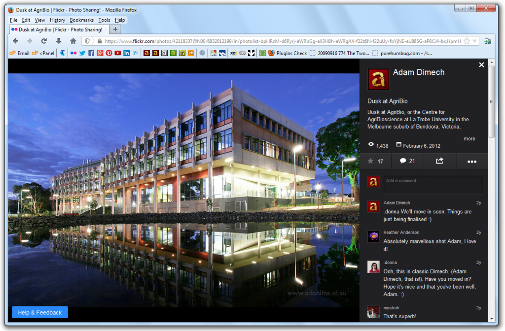
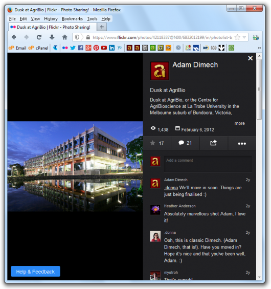
The panel on the right is fixed-width whilst the image on the left will re-size. This works well for large desktop monitors but as can be demonstrated with a simple browser resize, is sub-optimal with smaller screen widths. Smaller screens see a lot of ‘black space’ on portrait-oriented photo pages:
It is my firm view that Flickr should be working towards an entirely responsive web design and quickly depart from fixed-width components for the very reason above. Given that Flickr is a photography-based website, the photos must come first. I realise that this is Flickr’s aim (and that is commendable) but the execution needs some work.
I’d suggest that a CSS @media query break-point be inserted so that large screens see the comments/metadata panel on the right of the image and smaller screens have it displayed below the image. That way, the photo will always remain the primary focus.
Given that the page is in ‘beta’ mode and that a “Help and Feedback” button is provided, Flickr are clearly keen to receive people’s views.
As for the contents of that panel on the right, I am generally happy although I am still sorry that geotagging has been depreciated.
I have noticed that the EXIF data has been further summarised with no link to the full EXIF data page, which is a pity. I believe a link should be provided for those of us who like to view an image’s technical specifications.
I also note that tags are now presented with a hashtag (ie: ‘#canberra’ instead of ‘canberra’) but otherwise offer the same functionality. This is a purely cosmetic change.
I would give the new design 7/10. The new layout certainly looks good on a big desktop but if the page could be further optimised for smaller screen widths, I believe it would function much better.
On that point, I do realise that there’s an app for Flickr, but the app lacks some of the functionality that the site has. For that reason, there are occasions when I want to access the website from a mobile device but at this point, it’s rather difficult to use.
I applaud Flickr’s commitment to improvement. It’s far better than stagnation.
Comments
No comments have yet been submitted. Be the first!