Rebuilding my website: 2020
It’s been seven years since I last re-designed my personal website. Here is a look at the technologies that I used to build my new website.
It’s been seven years since my website was redesigned. Back in 2013, responsive web design was becoming very important at a time when smart phones and tablets were becoming commonplace. The new HTML5 and CSS3 specifications were making an impact and websites were starting to use typography as a key design element, via @font-face.
I have written about the broader design changes on The Grapevine. Here on Code, I wanted to write about the coding approaches and principles that I have employed for this version of my website.
Browsers and Web Standards
Everything is hand-coded, included a variety of static pages utilising HTML and PHP (Sublime is my text editor of choice). I also had to rebuild two WordPress themes. The new design needed to be clean, uncluttered and intuitive for users. In recent years, Google Chrome has become the predominant browser and Firefox has seen a significant decline in popularity. Internet Explorer is (thankfully) almost eliminated from the browsing landscape, but Microsoft’s new browser Edge is starting to become more widespread.

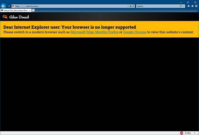
I decided to remove all support for IE. Anyone who attempts to view this site on any version of IE will see a black screen with a simple message advising them to use a different browser. In designing this website, I tested against the following browsers:
- Microsoft Edge (legacy)
- Microsoft Edge (webkit)
- Google Chrome (Windows and Android)
- Mozilla Firefox (Windows, Android and iOS)
- Safari
A commitment to using modern web standards by the various browser vendors meant that the site rendering differences between each of these browsers was small.
I also decided that I wanted to eliminate vendor-prefixes in CSS this time around and I succeeded. This would have been a challenge in 2013 but these days it’s fairly easy, at least for what I was building.
Accessibility and Dark Mode
Accessibility is really important and I did my best to ensure that my website will work for people accessing the site with screen readers.
Dark Mode is a really big phenomenon in web design at the moment, but I’m not sure how many people outside the world of IT actually use it. It is for this reason that I decided not to have a dark mode “toggle” setting. Aside from the complexity of coding such a feature, I concluded that those who really like dark mode would probably have their browser and/or operating system set to Dark Mode.
Using CSS, I deployed @media (prefers-color-scheme: dark) {} in CSS to target users who had set Dark Mode as a preference and serve them the dark version of the website. Everyone else gets the normal presentation. To compensate for the dark theme, images in Dark Mode are set with an opacity of 0.85 to reduce brightness. If a user hovers their mouse over an image (or taps on it), it will gently switch to an opacity of 1.0:
@media (prefers-color-scheme: dark) {
  img {
    opacity: .85;
    transition: opacity .5s ease-in-out;
  }
  img:hover {
    opacity: 1;
  }
}
Grid and Flexbox
The new design employs two new developments in CSS that have arisen since 2013; Grid and Flexbox.
I have used these extensively for page layouts and have found them to be extremely easy to code (after the initial learning curve).
Google Fonts
I decided to utilise Google Fonts for typography in this design. In a departure from past practice, I opted for Google-hosted fonts via @import in CSS rather than self-hosting. This does introduce another third-party dependency but should also pay-off in improved font loading times.
Minimal JavaScript and no jQuery
Back in 2013, jQuery was massive. It’s still massive but for many web designers it’s quickly losing favour these days. There are many reasons for this, but the biggest problem for many web designs is that they are loading a massive jQuery library and then using only a fraction of its features, many of which could be written in vanilla JavaScript. In effect, it is slowing down many websites needlessly.
I decided to ditch jQuery altogether for this design and it hasn’t been missed. I also decided to try and minimise the use of JavaScript too (as part of a progressive enhancement approach) and have eliminated it from most parts of the website. The two exceptions are
- Highlight.js which is an excellent syntax highlighter
- Flickr: I needed a small piece of JavaScript to show previews of my latest Flickr photos on my main page.
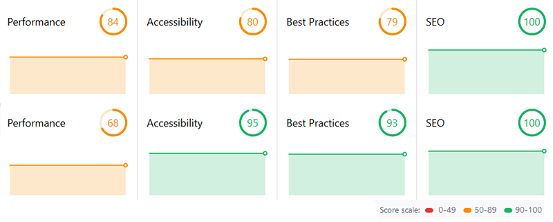
Taking this approach on my personal website has reduced overhead and significantly improved performance (except that I now have a large landing page image).

Significantly, I have managed to build a CSS-only “hamburger menu”. This wasn’t easy (and I will write the method up as a separate blog post at a later date), but what it means is that it should work for everyone. Always.
New Image Formats
Since 2013, scalable vector graphics (SVG) have gone mainstream and I have utilised them where I can. In particular, I have used SVGs to eliminate the use of “icon fonts” that reduce page accessibility for users with screen readers. The use of inlineSVG in CSS is a really versatile way to style a website.
I have also dabbled with WebP images as a replacement for PNG and JPEG images. Unfortunately certain versions of iOS still do not support WebP, so I have had to ensure that there are fallbacks.
ReCAPTCHA v3
Google released reCAPTCHA v3 a while ago to eliminate those horrendous “I am not a robot” check boxes, which are inevitably followed by image matrices asking users to identify squares with “crosswalks” (zebra crossings in Australia), “store fronts” (shop fronts in Australia), “sidewalks” (footpaths in Australia) and so on.
Setting-up reCAPTCHA v3 was a real challenge, but now that it’s set-up it seems to be working well. Hopefully my contact form is subjected to far less spam and abuse.
HTTPS Everywhere
My website consists of multiple sub-sites, many of which are also in need of a redesign (some are not even responsive). Whilst this remained on my “to-do” list, I was unable to implement HTTPS everywhere.
This redesign comes with a clearing-out of old legacy sites that have been given the chop. For those that remained, I quickly converted them to HTTPS pending a proper mobile-friendly redesign. This meant that I was able to edit my .htaccess file to force HTTPS site-wide:
RewriteEngine On
RewriteCond %{HTTP_HOST} ^adonline.id.au [NC]
RewriteCond %{HTTPS} off
RewriteRule ^(.*)$ https://%{HTTP_HOST}%{REQUEST_URI} [R=301,L]
Git
Version control for this website is now managed via GitHub. Git is awesome and I just wish it’d been accessible last time!
Comments
No comments have yet been submitted. Be the first!