Rescaling Data in R
A simple methodology for rescaling multiple series of data via min-max normalisation in R, then plotting.
Recently I had to work with a set of colour information data extracted from some photographs. The software programme I used extracted colour frequency data for the RGB (Red, Green, Blue), HSV (Hue, Saturation, Value) and L*a*b (Lightness, Green-Magenta, Blue Yellow) channels and recorded them in a CSV file with the following structure:
| barcode | date | line | treatment | trait | value | label |
|---|---|---|---|---|---|---|
| B2018010t0c00n153 | 5/09/2019 | 0 | 0 | blue_frequencies | 0 | 0 |
| B2018010t0c00n153 | 5/09/2019 | 0 | 0 | blue_frequencies | 0 | 1 |
| B2018010t0c00n153 | 5/09/2019 | 0 | 0 | blue_frequencies | 1 | 2 |
| B2018010t0c00n153 | 5/09/2019 | 0 | 0 | blue_frequencies | 8 | 3 |
| B2018010t0c00n153 | 5/09/2019 | 0 | 0 | blue_frequencies | 32 | 4 |
| … | … | … | … | … | …n | …255 |
The trait attribute describes the channel that was being measured (so in the above case blue_frequencies is the blue channel from the RGB colour model). The trait column contained nine different descriptors:
- blue-yellow_frequencies (b)
- blue_frequencies (B)
- green-magenta_frequencies (a)
- green_frequencies (G)
- hue_frequencies (H)
- lightness_frequencies (L)
- red_frequencies (R)
- saturation_frequencies (S)
- value_frequencies (V)
For each of these, the label column contained a numeric value for frequency whilst the value column contained a count of the number of pixels in the image that were measured at that frequency within the named colour model.
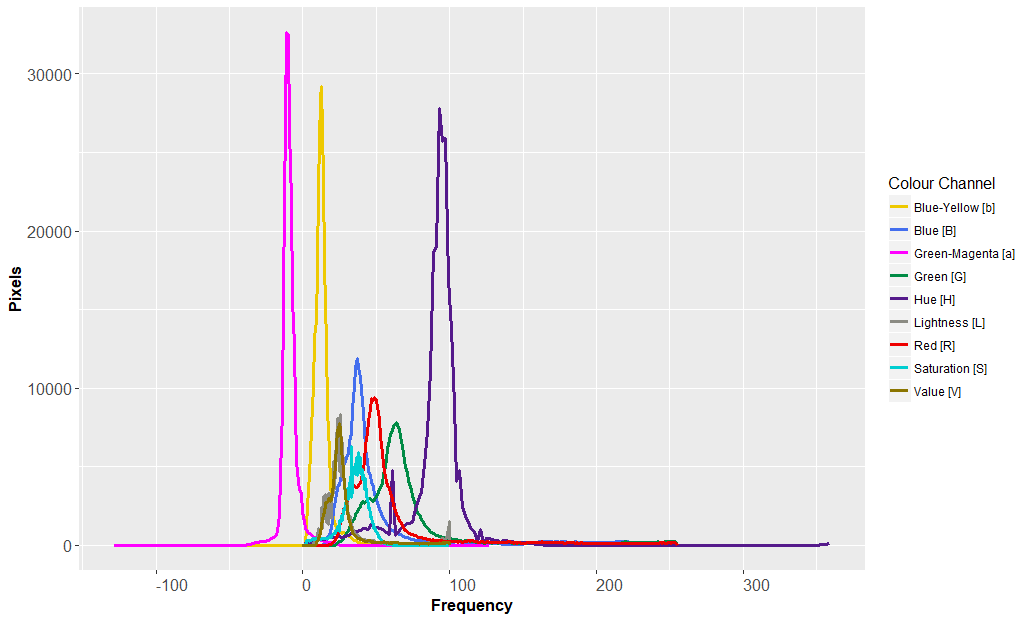
My aim was to graph all nine histograms on a single plot in R. The problem was that the different colour models were all using different scales:
- The RGB model has a scale between 0 and 255 for red, green and blue.
- The L*a*b model has a scale between -128 and 128 for blue-yellow, green-magenta and lightness.
- The HSV model has a scale between 1 and 359 for hue and 0 and 100 for saturation and value.
Clearly plotting these on the same chart would result in a histogram that was very messy and difficult to read:
The solution was to rescale the data using a normalisation calculation to place all the values into bins. The mathematics for this is as follows:
\[x’=a +{(x-min(x))(b-a)\over(max(x)-min(x))}\]
where x is the original value (label), x’ is the normalised value, a is the desired minimum value and b is the desired maximum value. Since I wanted to bin my values between 0 and 255, a=0 and b=255.
To achieve the same result, the equation can be simplified:
\[x’={(x-min(x))\over(max(x)-min(x))}\times255\]
Normalising the data in R
The real challenge was to translate this equation into R code. Here’s how I did it using the dplyr package:
My table of values were loaded into a data frame called “table1”. From this, made a new data frame (called “table2”) that contained the new series of transformed data that I generated using the mutate function:
library(dplyr)
table2 <- table1 %>% group_by(trait) %>% mutate(bin = (label - min(label)) / (max(label) - min(label)) * 255)
The new column of data was listed in a column called bin.
Unfortunately some of the bin values were decimals and I wanted my values to be integers between 0 and 255. This was easy to fix with a round function:
table2 <- table1 %>% group_by(trait) %>% mutate(bin = round((label - min(label)) / (max(label) - min(label)) * 255, 0))Next, I added bin as a variable:
bin_value <- table2$binNext, I could use the ggplot2 package to plot my histograms:
library(ggplot2)
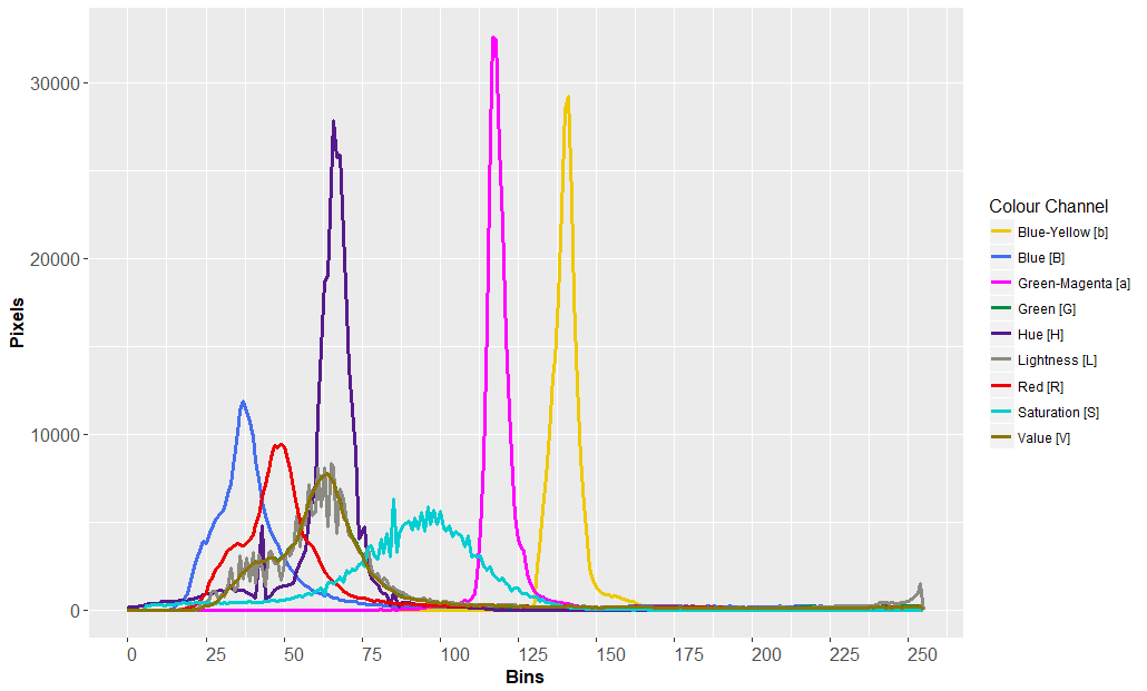
ggplot(table2) + geom_line(aes(x = bin_value, y = value, color = trait))The final result (with more elaborate ggplot2 code*):
The data series can easily be exported into a new CSV for further statistical analysis using the following command:
write.csv(table2,"c:\path\to\results.csv", row.names = TRUE)Importing large CSV files
CSV files of this sort can be massive and take a long time to load into R. A good tip for quickly importing large CSV files is to use the data.table package:
library(data.table)
my.data <- fread("c:/path/to/my_data.csv", data.table=FALSE)
*The ggplot2 code
Making pretty graphs with ggplot2 is a bit of an art. Here’s the code that I used:
ggplot(table2) + geom_line(aes(x = bin_value, y = value, color = trait), size=1.1) + labs(x="Bins", y="Pixels") + theme(axis.text.x = element_text(angle = 0, vjust = 0.2, hjust = 0.0, size=12), axis.text.y = element_text(size=12), axis.title.x = element_text(size=12, face="bold"), axis.title.y = element_text(size=12, face="bold"), title = element_text(size=12)) + scale_x_continuous(breaks = seq(min(bin_value), max(bin_value), by = 25)) + scale_color_manual(name="Colour Channel", labels = c("Blue-Yellow [b]", "Blue [B]", "Green-Magenta [a]", "Green [G]", "Hue [H]", "Lightness [L]", "Red [R]", "Saturation [S]", "Value [V]"), values=c("gold2", "royalblue2", "magenta", "springgreen4", "purple4", "ivory4", "red2", "darkturquoise", "gold4"))
Comments
No comments have yet been submitted. Be the first!